- Typography
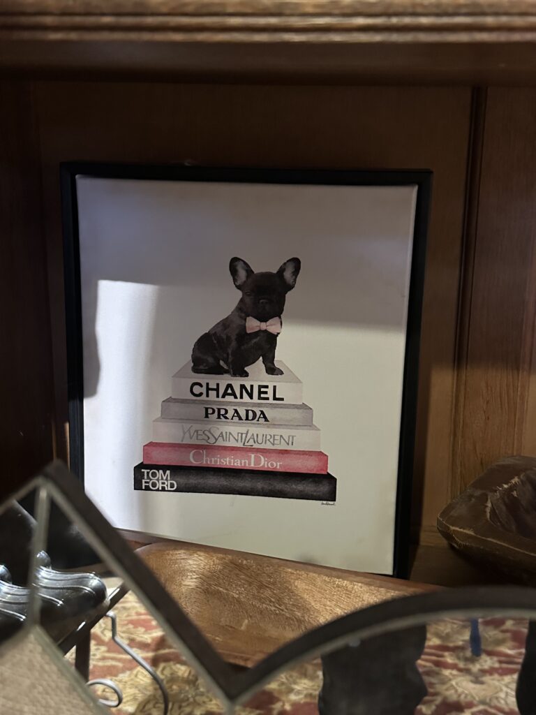
The photo that I took of the dog painting exhibited the use of typography perfectly because each of the platforms that the dog is standing on has a different brand name and with that, has its own font that it is painted in to correspond with that brand and the vibe that it gives. For example, the Chanel platform is a bold font, while the Yves St Laurent platform is a lot more complex, of a font, and can be interpreted as a “fancier” font. This is effective because it gives contrast between each of the platforms (brands).
2. Color and 3. Dominance
The glass container of hot pink and shiny decorations is an example of the use of color in a composition because the hot pink and shininess of the decorations are intended to get the person’s attention, so this also overlaps with dominance, due to it being the centerpiece. This works because every time I pass by it, I have to look at it. It is effective if your objective is to give strong reactions and to be noticed.

4. Metaphor/ Symbol
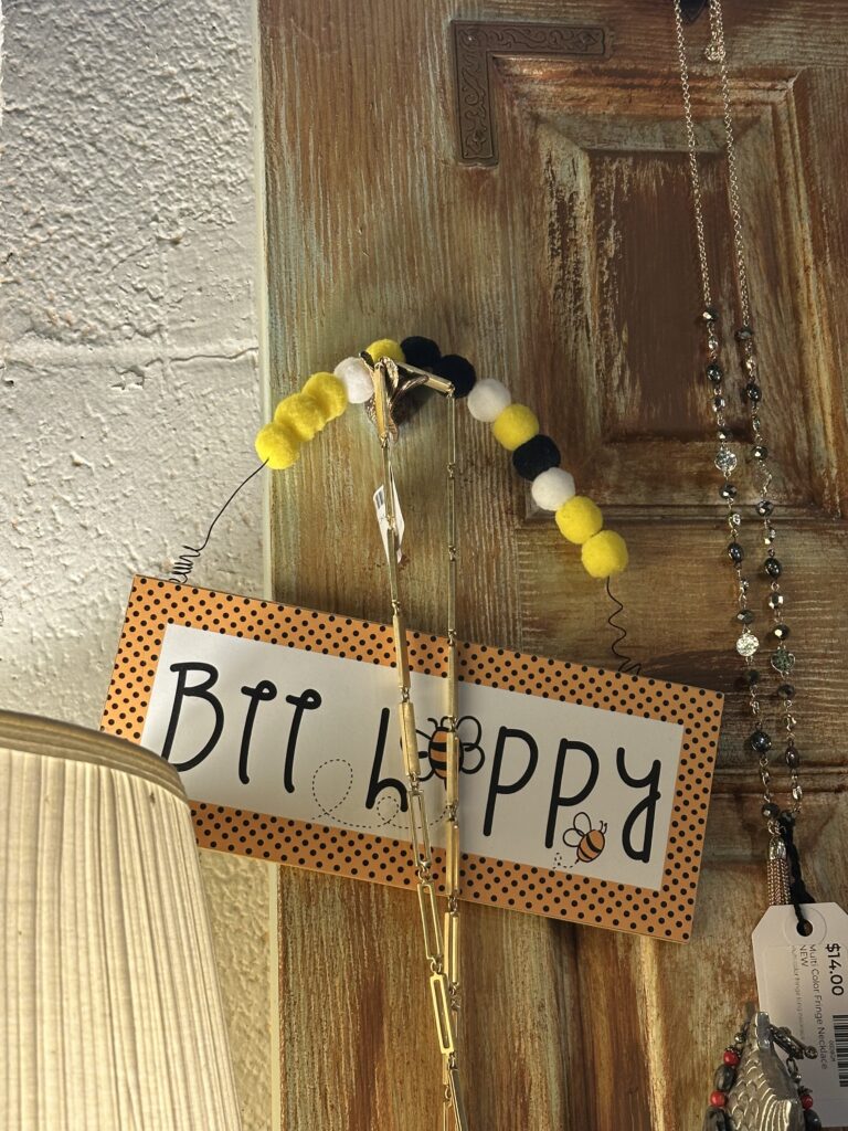
The “Bee Happy” sign is an example of the metaphor/ symbol design concept because it uses a bee to symbolize happiness, joy, and brightness. Oftentimes, it is combined with sunshine or flowers to give positive vibes. There are many roots to why bees are used as a symbol, including religious and folklore history. This has been a common and successful marketing technique, using the metaphor of a bee to represent working hard “busy as a bee” or to live a happy life “bee happy”.